Keeping it Simple is Harder than it Looks
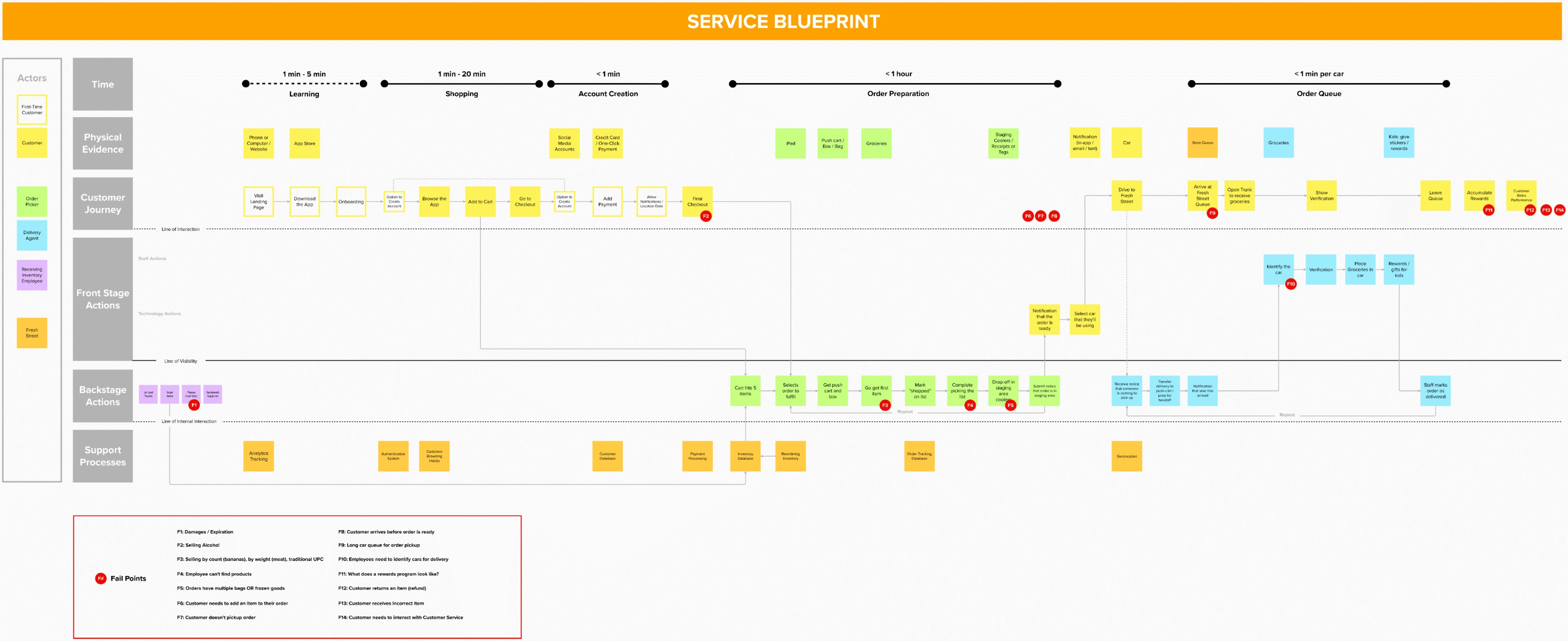
We did a quick discovery. We focused on understanding just enough of the fulfillment process so we could ensure the user would not be confused along the way. To get this understanding, we met with the client stakeholders and SMEs and created a service blueprint map. This map documented the process at a high level and identified the areas in the process the user could encounter confusion or friction.
With this blueprint as our guide, we created a sitemap to understand the scope of the design work. The client wanted us to create an experience that took the user through their ordering process to picking up the groceries in the quickest way possible. So we decided to follow a typical ecommerce structure for the site since this would be the least confusing for users.
Once we understood everything we needed to design, I created wireframes of the key pages for the UI designer to work from. These pages provided the structure of the site and the priority for each page. The UI designer brought the designs to high fidelity. Throughout the process, I'd review the UI designers work to provide feedback and direction to ensure the vision the client wanted came to life through the experience.